busog
belly
Branding

Visual Design
about
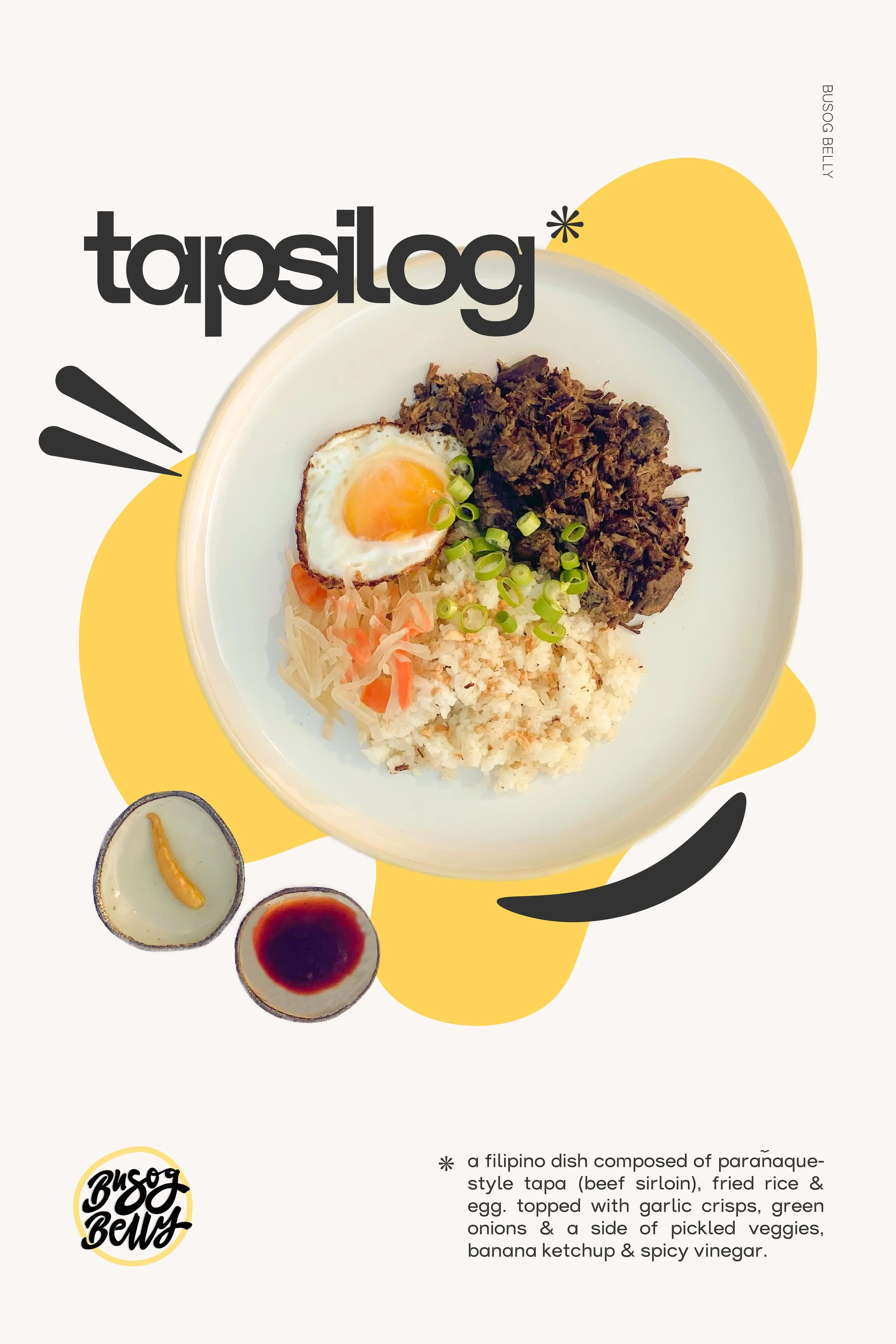
Client: Busog Belly, Software(s): Adobe: Illustrator & Photoshop
Busog Belly is an extension of our family business: Dough Momma. We wanted to tie in both sweet and savory selections during our food fairs and events but also being able to distinguish and separate both entities when only one or the other is needed. Busog in the Filipino native tongue, Tagalog, is translated to “full.” In English, Busog Belly means full belly.
Social Design

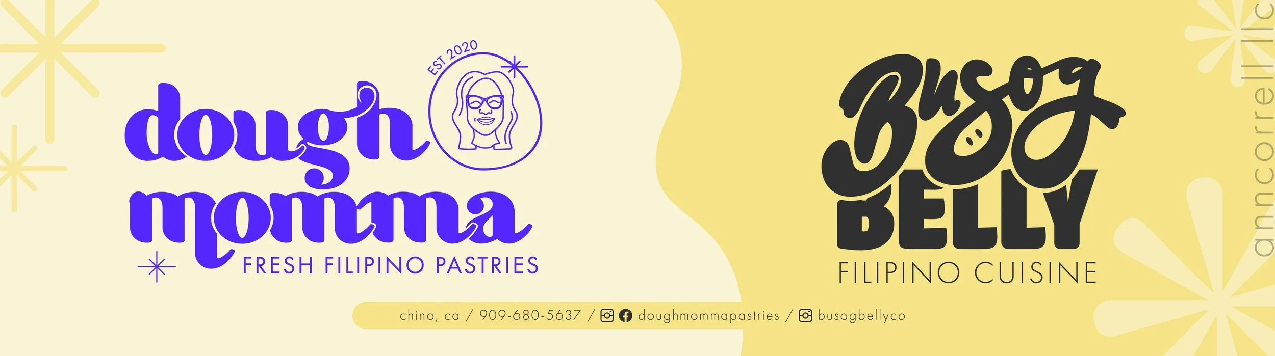
dough momma x busog belly collab
Due to the overwhelming response both Busog Belly and Dough Momma received during tabling events, we decided to do a collab, marketing both entities. Both businesses were offered at events, offering dinner AND dessert!
This became a success with customers, recognizing both businesses separately and enjoying the concept of being able to buy from each vendor at one event.
Putting together the banner for Dough Momma and Busog Belly was really fun since we purposefully used yellow in both branding. Before starting with Busog Belly, we knew that eventually we would want to combine both entities in some way so I wanted to tie in both somehow. Using yellow for both of their branding helped join them together but still had a “pop” factor when customers would see the banner. The bright yellow made it engaging, warm, and welcoming.